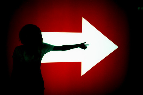
I like the simplicity in this photo. It's an image of a person in front of a wall, arm outstretched to mirror the signage. The size of the white arrow is big enough to dominate the frame and loudly dictate: this way. The arm and index finger are nearly completely overshadowed and outweighed by this massive symbol, and yet, the arm stands out almost as much as the arrow. There's an interesting play between positive and negative space. Is the red wall the solid, with a cutout form of an arrow? Or is white the positive space atop a red background? How then does the arm factor in as an additional form? Is it a positive space surrounded by a colorless negative? Or vice versa?
There's also a juxtaposition of curves and angles: the organic and inorganic. Because the wall is backlit, the figure in the foreground is thrown into near total silhouette, not only creating a play between light and dark, but emphasizing the lines and curves of the human form versus the angular form of the arrow. What's so cool here is that we have two geometrically opposite shapes that convey to us the exact same message. A rectangle with a big triangle on the end registers as "arrow" which registers as "this way." A person with arm stretched out away from the body, three fingers curled in, registers as "person pointing" which registers as "this way" too.
I think the vignetting from the Lomo LC-A camera helps to further emphasize the brightness of that arrow. The use of the arrow as the primary light source is beautifully done. I especially like how the figure isn't totally dark, the light subtly washing across the t-shirt and wrapping around the arm and fingers. What a cool effect.
Thursday, February 21, 2008
Direction
![]()
Subscribe to:
Post Comments (Atom)
No comments:
Post a Comment